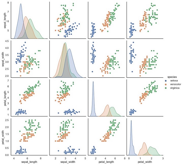
Scatter Matrix Plot is a graphical representation of the relationship between multiple variables. It is a useful tool in machine learning for visualizing the correlation between features in a dataset. This plot is also known as a Pair Plot, and it is used to identify the correlation between two or more variables in a dataset.
A Scatter Matrix Plot displays the scatter plot of each pair of features in a dataset. Each scatter plot represents the relationship between two variables. It is also possible to add a diagonal line to the plot that shows the distribution of each variable.
Python Implementation of Scatter Matrix Plot
Here, we will implement the Scatter Matrix Plot in Python. For our example given below, we will be using Sklearn’s Iris dataset.
The Iris dataset is a classic dataset in machine learning. It contains four features: Sepal Length, Sepal Width, Petal Length, and Petal Width. The dataset has 150 samples, and each sample is labeled as one of three species: Setosa, Versicolor, or Virginica.
We will use the Seaborn library to implement the Scatter Matrix Plot. Seaborn is a Python data visualization library that is built on top of the Matplotlib library.
Example
Below is the Python code to implement the Scatter Matrix Plot −
import seaborn as sns
import pandas as pd

# load iris dataset
iris = sns.load_dataset('iris')# create scatter matrix plot
sns.pairplot(iris, hue='species')# show plot
plt.show()
In this code, we first import the necessary libraries, Seaborn and Pandas. Then, we load the Iris dataset using the sns.load_dataset() function. This function loads the Iris dataset from the Seaborn library.
Next, we create the Scatter Matrix Plot using the sns.pairplot() function. The hue parameter is used to specify the column in the dataset that should be used for color encoding. In this case, we use the species column to color the points according to the species of each sample.
Finally, we use the plt.show() function to display the plot.
Output
The output of this code will be a Scatter Matrix Plot that shows the scatter plots of each pair of features in the Iris dataset.
Notice that each scatter plot is color-coded according to the species of each sample.
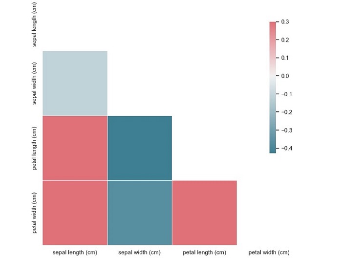
A correlation matrix plot is a graphical representation of the pairwise correlation between variables in a dataset. The plot consists of a matrix of scatterplots and correlation coefficients, where each scatterplot represents the relationship between two variables, and the correlation coefficient indicates the strength of the relationship. The diagonal of the matrix usually shows the distribution of each variable.
The correlation coefficient is a measure of the linear relationship between two variables and ranges from -1 to 1. A coefficient of 1 indicates a perfect positive correlation, where an increase in one variable is associated with an increase in the other variable. A coefficient of -1 indicates a perfect negative correlation, where an increase in one variable is associated with a decrease in the other variable. A coefficient of 0 indicates no correlation between the variables.
Python Implementation of Correlation Matrix Plots
Now that we have a basic understanding of correlation matrix plots, let’s implement them in Python. For our example, we will be using the Iris flower dataset from Sklearn, which contains measurements of the sepal length, sepal width, petal length, and petal width of 150 iris flowers, belonging to three different species – Setosa, Versicolor, and Virginica.
This code will produce a correlation matrix plot of the Iris dataset, with each square representing the correlation coefficient between two variables.
From this plot, we can see that the variables ‘sepal width (cm)’ and ‘petal length (cm)’ have a moderate negative correlation (-0.37), while the variables ‘petal length (cm)’ and ‘petal width (cm)’ have a strong positive correlation (0.96). We can also see that the variable ‘sepal length (cm)’ has a weak positive correlation (0.87) with the variable ‘petal length (cm)’.
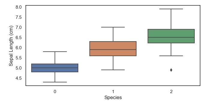
A boxplot is a graphical representation of a dataset that displays the five-number summary of the data – the minimum value, the first quartile, the median, the third quartile, and the maximum value.
The boxplot consists of a box with whiskers extending from the top and bottom of the box.
The box represents the interquartile range (IQR) of the data, which is the range between the first and third quartiles.
The whiskers extend from the top and bottom of the box to the highest and lowest values that are within 1.5 times the IQR.
Any values that fall outside this range are considered outliers and are represented as points beyond the whiskers.
Python Implementation of Box and Whisker Plots
Now that we have a basic understanding of boxplots, let’s implement them in Python. For our example, we will be using the Iris dataset from Sklearn, which contains measurements of the sepal length, sepal width, petal length, and petal width of 150 iris flowers, belonging to three different species – Setosa, Versicolor, and Virginica.
To start, we need to import the necessary libraries and load the dataset.
Example
import matplotlib.pyplot as plt
import seaborn as sns
from sklearn.datasets import load_iris
iris = load_iris()
data = iris.data
target = iris.target
Next, we can create a boxplot of the sepal length for each of the three iris species using the Seaborn library.
This code will produce a boxplot of the sepal length for each of the three iris species, with the x-axis representing the species and the y-axis representing the sepal length in centimeters.
From this boxplot, we can see that the setosa species has a shorter sepal length compared to the versicolor and virginica species, which have a similar median and range of sepal lengths. Additionally, we can see that there are no outliers in the setosa species, but there are a few outliers in the versicolor and virginica specie.
A density plot is a type of plot that shows the probability density function of a continuous variable. It is similar to a histogram, but instead of using bars to represent the frequency of each value, it uses a smooth curve to represent the probability density function. The xaxis represents the range of values of the variable, and the y-axis represents the probability density.
Density plots are useful for identifying patterns in data, such as skewness, modality, and outliers. Skewness refers to the degree of asymmetry in the distribution of the variable. Modality refers to the number of peaks in the distribution. Outliers are data points that fall outside of the range of typical values for the variable.
Python Implementation of Density Plots
Python provides several libraries for data visualization, such as Matplotlib, Seaborn, Plotly, and Bokeh. For our example given below, we will use Seaborn to implement density plots.
We will use the breast cancer dataset from the Sklearn library for this example. The breast cancer dataset contains information about the characteristics of breast cancer cells and whether they are malignant or benign. The dataset has 30 features and 569 samples.
Example
Let’s start by importing the necessary libraries and loading the dataset −
import matplotlib.pyplot as plt
import seaborn as sns
from sklearn.datasets import load_breast_cancer
data = load_breast_cancer()
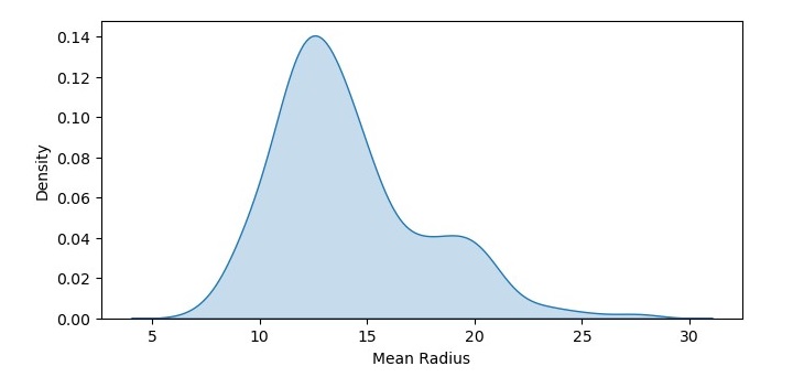
Next, we will create a density plot of the mean radius feature of the dataset −
In this code, we have used the kdeplot() function from Seaborn to create a density plot of the mean radius feature of the dataset. We have set the shade parameter to True to shade the area under the curve. We have also added labels to the x and y axes using the xlabel() and ylabel() functions.
Output
The resulting density plot shows the probability density function of mean radius values in the dataset. We can see that the data is roughly normally distributed, with a peak around 12-14.
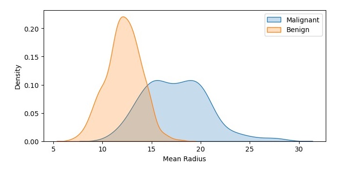
Density Plot with Multiple Data Sets
We can also create a density plot with multiple data sets to compare their probability density functions. Let’s create density plots of the mean radius feature for both the malignant and benign samples −
In this code, we have used the kdeplot() function twice to create two density plots of the mean radius feature, one for the malignant samples and one for the benign samples. We have set the shade parameter to True to shade the area under the curve, and we have added labels to the plots using the label parameter. We have also added a legend to the plot using the legend() function.
Output
On executing this code, you will get the following plot as the output −
The resulting density plot shows the probability density functions of mean radius values for both the malignant and benign samples. We can see that the probability density function for the malignant samples is shifted to the right, indicating a higher mean radius value.
A histogram is a bar graph-like representation of the distribution of a variable. It shows the frequency of occurrences of each value of the variable. The x-axis represents the range of values of the variable, and the y-axis represents the frequency or count of each value. The height of each bar represents the number of data points that fall within that value range.
Histograms are useful for identifying patterns in data, such as skewness, modality, and outliers. Skewness refers to the degree of asymmetry in the distribution of the variable. Modality refers to the number of peaks in the distribution. Outliers are data points that fall outside of the range of typical values for the variable.
Python Implementation of Histograms
Python provides several libraries for data visualization, such as Matplotlib, Seaborn, Plotly, and Bokeh. For the example given below, we will use Matplotlib to implement histograms.
We will use the breast cancer dataset from the Sklearn library for this example. The breast cancer dataset contains information about the characteristics of breast cancer cells and whether they are malignant or benign. The dataset has 30 features and 569 samples.
Example
Let’s start by importing the necessary libraries and loading the dataset −
import matplotlib.pyplot as plt
from sklearn.datasets import load_breast_cancer
data = load_breast_cancer()
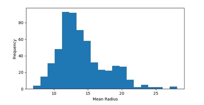
Next, we will create a histogram of the mean radius feature of the dataset −
In this code, we have used the hist() function from Matplotlib to create a histogram of the mean radius feature of the dataset. We have set the number of bins to 20 to divide the data range into 20 intervals. We have also added labels to the x and y axes using the xlabel() and ylabel() functions.
Output
The resulting histogram shows the distribution of mean radius values in the dataset. We can see that the data is roughly normally distributed, with a peak around 12-14.
Histogram with Multiple Data Sets
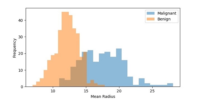
We can also create a histogram with multiple data sets to compare their distributions. Let’s create histograms of the mean radius feature for both the malignant and benign samples −
In this code, we have used the hist() function twice to create two histograms of the mean radius feature, one for the malignant samples and one for the benign samples. We have set the transparency of the bars to 0.5 using the alpha parameter so that they don’t overlap completely. We have also added a legend to the plot using the legend() function.
Output
On executing this code, you will get the following plot as the output −
The resulting histogram shows the distribution of mean radius values for both the malignant and benign samples. We can see that the distributions are different, with the malignant samples having a higher frequency of higher mean radius values.
Data visualization is an important aspect of machine learning (ML) as it helps to analyze and communicate patterns, trends, and insights in the data. Data visualization involves creating graphical representations of the data, which can help to identify patterns and relationships that may not be apparent from the raw data.
What is Data Visualization?
Data visualization is a graphical representation of data and information. With the help of data visualization, we can see how the data looks like and what kind of correlation is held by the attributes of the data. It is the fastest way to see if the features correspond to the output.
Importance of Data Visualization in Machine Learning
The data visualization play a significant role in machine learning. We can use it in many ways in machine learning. Here are some of the ways data visualization is used in machine learning −
Exploring Data − Data visualization is an essential tool for exploring and understanding data. Visualization can help to identify patterns, correlations, and outliers and can also help to detect data quality issues such as missing values and inconsistencies.
Feature Selection − Data visualization can help to select relevant features for the ML model. By visualizing the data and its relationship with the target variable, you can identify features that are strongly correlated with the target variable and exclude irrelevant features that have little predictive power.
Model Evaluation − Data visualization can be used to evaluate the performance of the ML model. Visualization techniques such as ROC curves, precision-recall curves, and confusion matrices can help to understand the accuracy, precision, recall, and F1 score of the model.
Communicating Insights − Data visualization is an effective way to communicate insights and results to stakeholders who may not have a technical background. Visualizations such as scatter plots, line charts, and bar charts can help to convey complex information in an easily understandable format.
Popular Python Libraries for Data Visualization
Following are the most popular Python libraries for data visualization in Machine learning. These libraries provide a wide range of visualization techniques and customization options to suit different needs and preferences.
1. Matplotlib
Matplotlib is one of the most popular Python packages used for data visualization. It is a cross-platform library for making 2D plots from data in arrays. It provides an object-oriented API that helps in embedding plots in applications using Python GUI toolkits such as PyQt, WxPython, or Tkinter. It can be used in Python and IPython shells, Jupyter notebook and web application servers also.
2. Seaborn
Seaborn is an open source, BSD-licensed Python library providing high level API for visualizing the data using Python programming language.
3. Plotly
Plotly is a Montreal based technical computing company involved in development of data analytics and visualisation tools such as Dash and Chart Studio. It has also developed open source graphing Application Programming Interface (API) libraries for Python, R, MATLAB, Javascript and other computer programming languages.
4. Bokeh
Bokeh is a data visualization library for Python. Unlike Matplotlib and Seaborn, they are also Python packages for data visualization, Bokeh renders its plots using HTML and JavaScript. Hence, it proves to be extremely useful for developing web based dashboards.
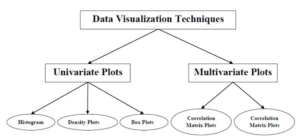
Types of Data Visualization
Data visualization for machine learning data can be classified into two different categories as follows –
Univariate Plots
Multivariate Plots
Let’s understand each of the above two type of data visualization plots in detail.
The simplest type of visualization is single-variable or univariate visualization. With the help of univariate visualization, we can understand each attribute of our dataset independently. The following are some techniques in Python to implement univariate visualization −
Histograms
Density Plots
Box and Whisker Plots
We will learn the above techniques in detail in their respective chapters. Let’s look at these techniques in brief.
Histograms
Histograms group the data in bins and is the fastest way to get an idea about the distribution of each attribute in the dataset. The following are some of the characteristics of histograms −
It provides us a count of the number of observations in each bin created for visualization.
From the shape of the bin, we can easily observe the distribution, i.e., whether it is Gaussian, skewed, or exponential.
Histograms also help us to see possible outliers.
Example
The code below is an example of a Python script creating the histogram. Here, we will be using hist() function on NumPy Array to generate histograms and matplotlib for plotting them.
import matplotlib.pyplot as plt
import numpy as np
# Generate some random data
data = np.random.randn(1000)# Create the histogram
plt.hist(data, bins=30, color='skyblue', edgecolor='black')
plt.xlabel('Values')
plt.ylabel('Frequency')
plt.title('Histogram Example')
plt.show()
Output
Because of random number generation, you may notice a slight difference between the outputs when you execute the above program.
Density Plots
Density Plot is another quick and easy technique for getting each attribute distribution. It is also like histogram but having a smooth curve drawn through the top of each bin. We can call them as abstracted histograms.
Example
In the following example, the Python script will generate Density Plots for the distribution of attributes of the iris dataset.
import seaborn as sns
import matplotlib.pyplot as plt
# Load a sample dataset
df = sns.load_dataset("iris")# Create the density plot
sns.kdeplot(data=df, x="sepal_length", fill=True)# Add labels and title
plt.xlabel("Sepal Length")
plt.ylabel("Density")
plt.title("Density Plot of Sepal Length")# Show the plot
plt.show()
Output
From the above output, the difference between Density plots and Histograms can be easily understood.
Box and Whisker Plots
Box and Whisker Plots, also called boxplots in short, is another useful technique to review the distribution of each attributes distribution. The following are the characteristics of this technique −
It is univariate in nature and summarizes the distribution of each attribute.
It draws a line for the middle value i.e. for median.
It draws a box around the 25% and 75%.
It also draws whiskers which will give us an idea about the spread of the data.
The dots outside the whiskers signifies the outlier values. Outlier values would be 1.5 times greater than the size of the spread of the middle data.
Example
In the following example, the Python script will generate a Box and Whisker Plot for the distribution of attributes of the Iris dataset.
import matplotlib.pyplot as plt
# Sample data
data =[10,15,18,20,22,25,28,30,32,35]# Create a figure and axes
fig, ax = plt.subplots()# Create the boxplot
ax.boxplot(data)# Set the title
ax.set_title('Box and Whisker Plot')# Show the plot
plt.show()
Output
Multivariate Plots: Interaction Among Multiple Variables
Another type of visualization is multi-variable or multivariate visualization. With the help of multivariate visualization, we can understand the interaction between multiple attributes of our dataset. The following are some techniques in Python to implement multivariate visualization −
Correlation Matrix Plot
Scatter Matrix Plot
Correlation Matrix Plot
Correlation is an indication of the changes between two variables. We can plot correlation matrix plot to show which variable is having a high or low correlation in respect to another variable.
Example
In the following example, the Python script will generate a correlation matrix plot. It can be generated with the help of corr() function on Pandas DataFrame and plotted with the help of Matplotlib pyplot.
import pandas as pd
import seaborn as sns
import matplotlib.pyplot as plt
# Sample data
data ={'A':[1,2,3,4,5],'B':[5,4,3,2,1],'C':[2,3,1,4,5]}
df = pd.DataFrame(data)# Calculate the correlation matrix
c_matrix = df.corr()# Create a heatmap
sns.heatmap(c_matrix, annot=True, cmap='coolwarm')
plt.title("Correlation Matrix")
plt.show()
Output
From the above output of the correlation matrix, we can see that it is symmetrical i.e. the bottom left is same as the top right.
Scatter Matrix Plot
Scatter matrix plot shows how much one variable is affected by another or the relationship between them with the help of dots in two dimensions. Scatter plots are very much like line graphs in the concept that they use horizontal and vertical axes to plot data points.
Example
In the following example, the Python script will generate and plot the Scatter matrix for the Iris dataset. It can be generated with the help of scatter_matrix() function on Pandas DataFrame and plotted with the help of pyplot.
import pandas as pd
import matplotlib.pyplot as plt
from sklearn import datasets
# Load the iris dataset
iris = datasets.load_iris()
df = pd.DataFrame(iris.data, columns=iris.feature_names)# Create the scatter matrix plot
pd.plotting.scatter_matrix(df, diagonal='hist', figsize=(8,7))
plt.show()
Output
In the next few chapters, we will look at some of the popular and widely used visualization techniques available in machine learning.