Hash Table is a data structure which stores data in an associative manner. In a hash table, data is stored in an array format, where each data value has its own unique index value. Access of data becomes very fast if we know the index of the desired data.
Thus, it becomes a data structure in which insertion and search operations are very fast irrespective of the size of the data. Hash Table uses an array as a storage medium and uses hash technique to generate an index where an element is to be inserted or is to be located from.
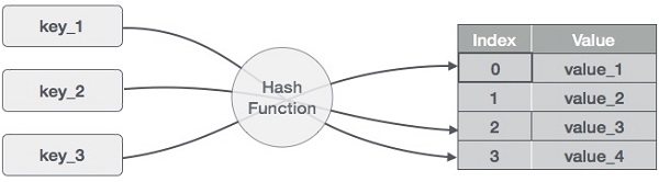
Hashing
Hashing is a technique to convert a range of key values into a range of indexes of an array. We’re going to use modulo operator to get a range of key values. Consider an example of hash table of size 20, and the following items are to be stored. Item are in the (key,value) format.
- (1,20)
- (2,70)
- (42,80)
- (4,25)
- (12,44)
- (14,32)
- (17,11)
- (13,78)
- (37,98)
| Sr.No. | Key | Hash | Array Index |
|---|---|---|---|
| 1 | 1 | 1 % 20 = 1 | 1 |
| 2 | 2 | 2 % 20 = 2 | 2 |
| 3 | 42 | 42 % 20 = 2 | 2 |
| 4 | 4 | 4 % 20 = 4 | 4 |
| 5 | 12 | 12 % 20 = 12 | 12 |
| 6 | 14 | 14 % 20 = 14 | 14 |
| 7 | 17 | 17 % 20 = 17 | 17 |
| 8 | 13 | 13 % 20 = 13 | 13 |
| 9 | 37 | 37 % 20 = 17 | 17 |
Linear Probing
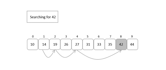
As we can see, it may happen that the hashing technique is used to create an already used index of the array. In such a case, we can search the next empty location in the array by looking into the next cell until we find an empty cell. This technique is called linear probing.
| Sr.No. | Key | Hash | Array Index | After Linear Probing, Array Index |
|---|---|---|---|---|
| 1 | 1 | 1 % 20 = 1 | 1 | 1 |
| 2 | 2 | 2 % 20 = 2 | 2 | 2 |
| 3 | 42 | 42 % 20 = 2 | 2 | 3 |
| 4 | 4 | 4 % 20 = 4 | 4 | 4 |
| 5 | 12 | 12 % 20 = 12 | 12 | 12 |
| 6 | 14 | 14 % 20 = 14 | 14 | 14 |
| 7 | 17 | 17 % 20 = 17 | 17 | 17 |
| 8 | 13 | 13 % 20 = 13 | 13 | 13 |
| 9 | 37 | 37 % 20 = 17 | 17 | 18 |
Basic Operations
Following are the basic primary operations of a hash table.
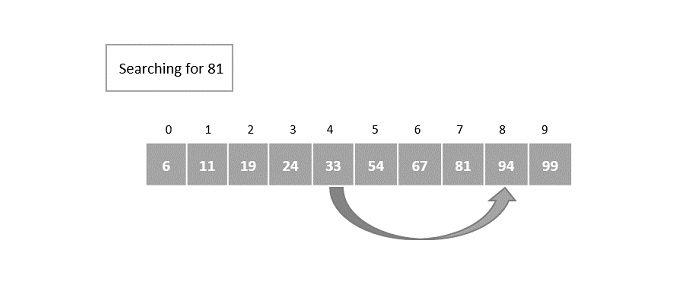
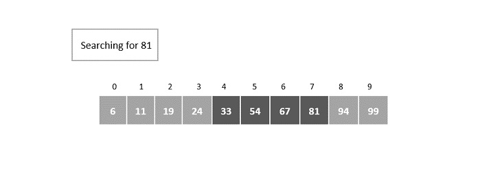
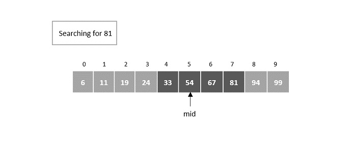
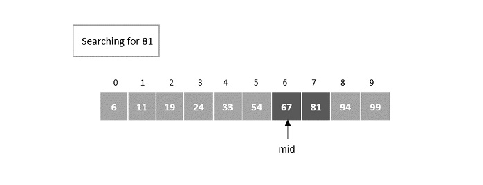
- Search − Searches an element in a hash table.
- Insert − Inserts an element in a hash table.
- Delete − Deletes an element from a hash table.
DataItem
Define a data item having some data and key, based on which the search is to be conducted in a hash table.
structDataItem{int data;int key;};
Hash Method
Define a hashing method to compute the hash code of the key of the data item.
inthashCode(int key){return key % SIZE;}
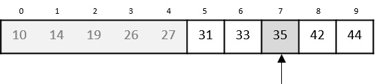
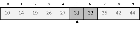
Search Operation
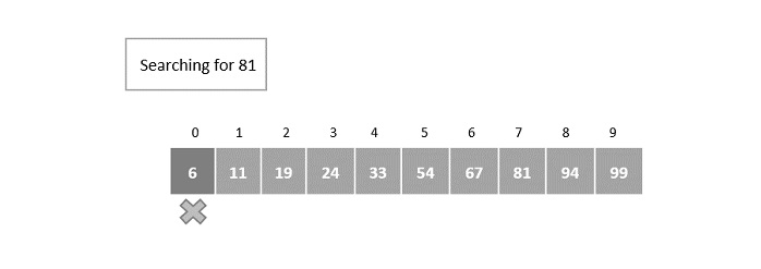
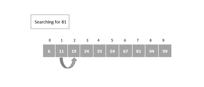
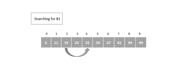
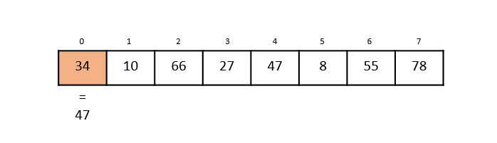
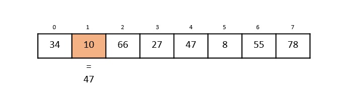
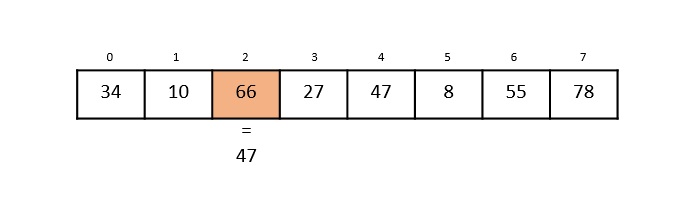
Whenever an element is to be searched, compute the hash code of the key passed and locate the element using that hash code as index in the array. Use linear probing to get the element ahead if the element is not found at the computed hash code.
structDataItem*search(int key){//get the hashint hashIndex =hashCode(key);//move in array until an emptywhile(hashArray[hashIndex]!=NULL){if(hashArray[hashIndex]->key == key)return hashArray[hashIndex];//go to next cell++hashIndex;//wrap around the table
      hashIndex %= SIZE;}returnNULL;}
Example
Following are the implementations of this operation in various programming language −
#include <stdio.h>#define SIZE 10 // Define the size of the hash tablestructDataItem{int key;};structDataItem*hashArray[SIZE];// Define the hash table as an array of DataItem pointersinthashCode(int key){// Return a hash value based on the keyreturn key % SIZE;}structDataItem*search(int key){// get the hashint hashIndex =hashCode(key);// move in array until an empty slot is found or the key is foundwhile(hashArray[hashIndex]!=NULL){// If the key is found, return the corresponding DataItem pointerif(hashArray[hashIndex]->key == key)return hashArray[hashIndex];// go to the next cell++hashIndex;// wrap around the table
        hashIndex %= SIZE;}// If the key is not found, return NULLreturnNULL;}intmain(){// Initializing the hash table with some sample DataItemsstructDataItem item2 ={25};// Assuming the key is 25structDataItem item3 ={64};// Assuming the key is 64structDataItem item4 ={22};// Assuming the key is 22// Calculate the hash index for each item and place them in the hash tableint hashIndex2 =hashCode(item2.key);
    hashArray[hashIndex2]=&item2;int hashIndex3 =hashCode(item3.key);
    hashArray[hashIndex3]=&item3;int hashIndex4 =hashCode(item4.key);
    hashArray[hashIndex4]=&item4;// Call the search function to test itint keyToSearch =64;// The key to search for in the hash tablestructDataItem*result =search(keyToSearch);printf("The element to be searched: %d", keyToSearch);if(result !=NULL){printf("\nElement found");}else{printf("\nElement not found");}return0;}
Output
The element to be searched: 64
Element found
Insert Operation
Whenever an element is to be inserted, compute the hash code of the key passed and locate the index using that hash code as an index in the array. Use linear probing for empty location, if an element is found at the computed hash code.
voidinsert(int key,int data){structDataItem*item =(structDataItem*)malloc(sizeof(structDataItem));
   item->data = data;
   item->key = key;//get the hash int hashIndex =hashCode(key);//move in array until an empty or deleted cellwhile(hashArray[hashIndex]!=NULL&& hashArray[hashIndex]->key !=-1){//go to next cell++hashIndex;//wrap around the table
      hashIndex %= SIZE;}

   hashArray[hashIndex]= item;}
Example
Following are the implementations of this operation in various programming languages −
#include <stdio.h>#include <stdlib.h>#define SIZE 4 // Define the size of the hash tablestructDataItem{int key;};structDataItem*hashArray[SIZE];// Define the hash table as an array of DataItem pointersinthashCode(int key){// Return a hash value based on the keyreturn key % SIZE;}voidinsert(int key){// Create a new DataItem using mallocstructDataItem*newItem =(structDataItem*)malloc(sizeof(structDataItem));if(newItem ==NULL){// Check if malloc fails to allocate memoryfprintf(stderr,"Memory allocation error\n");return;}

   newItem->key = key;// Initialize other data members if needed// Calculate the hash index for the keyint hashIndex =hashCode(key);// Handle collisions (linear probing)while(hashArray[hashIndex]!=NULL){// Move to the next cell++hashIndex;// Wrap around the table if needed
      hashIndex %= SIZE;}// Insert the new DataItem at the calculated index
   hashArray[hashIndex]= newItem;}intmain(){// Call the insert function with different keys to populate the hash tableinsert(42);// Insert an item with key 42insert(25);// Insert an item with key 25insert(64);// Insert an item with key 64insert(22);// Insert an item with key 22// Output the populated hash tablefor(int i =0; i < SIZE; i++){if(hashArray[i]!=NULL){printf("Index %d: Key %d\n", i, hashArray[i]->key);}else{printf("Index %d: Empty\n", i);}}return0;}
Output
Index 0: Key 64
Index 1: Key 25
Index 2: Key 42
Index 3: Key 22
Delete Operation
Whenever an element is to be deleted, compute the hash code of the key passed and locate the index using that hash code as an index in the array. Use linear probing to get the element ahead if an element is not found at the computed hash code. When found, store a dummy item there to keep the performance of the hash table intact.
structDataItem*delete(structDataItem* item){int key = item->key;//get the hash int hashIndex =hashCode(key);//move in array until an empty while(hashArray[hashIndex]!=NULL){if(hashArray[hashIndex]->key == key){structDataItem* temp = hashArray[hashIndex];//assign a dummy item at deleted position
         hashArray[hashIndex]= dummyItem;return temp;}//go to next cell++hashIndex;//wrap around the table
      hashIndex %= SIZE;}returnNULL;}
Example
Following are the implementations of the deletion operation for Hash Table in various programming languages −
#include <stdio.h>#include <stdlib.h>#define SIZE 5 // Define the size of the hash tablestructDataItem{int key;};structDataItem*hashArray[SIZE];// Define the hash table as an array of DataItem pointersinthashCode(int key){// Implement your hash function here// Return a hash value based on the key}voidinsert(int key){// Create a new DataItem using mallocstructDataItem*newItem =(structDataItem*)malloc(sizeof(structDataItem));if(newItem ==NULL){// Check if malloc fails to allocate memoryfprintf(stderr,"Memory allocation error\n");return;}

   newItem->key = key;// Initialize other data members if needed// Calculate the hash index for the keyint hashIndex =hashCode(key);// Handle collisions (linear probing)while(hashArray[hashIndex]!=NULL){// Move to the next cell++hashIndex;// Wrap around the table if needed
      hashIndex %= SIZE;}// Insert the new DataItem at the calculated index
   hashArray[hashIndex]= newItem;// Print the inserted item's key and hash indexprintf("Inserted key %d at index %d\n", newItem->key, hashIndex);}voiddelete(int key){// Find the item in the hash tableint hashIndex =hashCode(key);while(hashArray[hashIndex]!=NULL){if(hashArray[hashIndex]->key == key){// Mark the item as deleted (optional: free memory)free(hashArray[hashIndex]);
         hashArray[hashIndex]=NULL;return;}// Move to the next cell++hashIndex;// Wrap around the table if needed
      hashIndex %= SIZE;}// If the key is not found, print a messageprintf("Item with key %d not found.\n", key);}intmain(){// Call the insert function with different keys to populate the hash tableprintf("Hash Table Contents before deletion:\n");insert(1);// Insert an item with key 42insert(2);// Insert an item with key 25insert(3);// Insert an item with key 64insert(4);// Insert an item with key 22int ele1 =2;int ele2 =4;printf("The key to be deleted: %d and %d", ele1, ele2);delete(ele1);// Delete an item with key 42delete(ele2);// Delete an item with key 25// Print the hash table's contents after delete operationsprintf("\nHash Table Contents after deletion:\n");for(int i =1; i < SIZE; i++){if(hashArray[i]!=NULL){printf("Index %d: Key %d\n", i, hashArray[i]->key);}else{printf("Index %d: Empty\n", i);}}return0;}
Output
Hash Table Contents before deletion:
Inserted key 1 at index 1
Inserted key 2 at index 2
Inserted key 3 at index 3
Inserted key 4 at index 4
The key to be deleted: 2 and 4
Hash Table Contents after deletion:
Index 1: Key 1
Index 2: Empty
Index 3: Key 3
Index 4: Empty
Complete implementation
Following are the complete implementations of the above operations in various programming languages −
#include <stdio.h>#include <string.h>#include <stdlib.h>#include <stdbool.h>#define SIZE 20structDataItem{int data;int key;};structDataItem* hashArray[SIZE];structDataItem* dummyItem;structDataItem* item;inthashCode(int key){return key % SIZE;}structDataItem*search(int key){//get the hash int hashIndex =hashCode(key);//move in array until an empty while(hashArray[hashIndex]!=NULL){if(hashArray[hashIndex]->key == key)return hashArray[hashIndex];//go to next cell++hashIndex;//wrap around the table
      hashIndex %= SIZE;}returnNULL;}voidinsert(int key,int data){structDataItem*item =(structDataItem*)malloc(sizeof(structDataItem));
   item->data = data;
   item->key = key;//get the hash int hashIndex =hashCode(key);//move in array until an empty or deleted cellwhile(hashArray[hashIndex]!=NULL&& hashArray[hashIndex]->key !=-1){//go to next cell++hashIndex;//wrap around the table
      hashIndex %= SIZE;}
   hashArray[hashIndex]= item;}structDataItem*delete(structDataItem* item){int key = item->key;//get the hash int hashIndex =hashCode(key);//move in array until an emptywhile(hashArray[hashIndex]!=NULL){if(hashArray[hashIndex]->key == key){structDataItem* temp = hashArray[hashIndex];//assign a dummy item at deleted position
         hashArray[hashIndex]= dummyItem;return temp;}//go to next cell++hashIndex;//wrap around the table
      hashIndex %= SIZE;}returnNULL;}voiddisplay(){int i =0;for(i =0; i<SIZE; i++){if(hashArray[i]!=NULL)printf("(%d,%d) ",hashArray[i]->key,hashArray[i]->data);}printf("\n");}intmain(){
   dummyItem =(structDataItem*)malloc(sizeof(structDataItem));
   dummyItem->data =-1;
   dummyItem->key =-1;insert(1,20);insert(2,70);insert(42,80);insert(4,25);insert(12,44);insert(14,32);insert(17,11);insert(13,78);insert(37,97);printf("Insertion done: \n");printf("Contents of Hash Table: ");display();int ele =37;printf("The element to be searched: %d", ele);
   item =search(ele);if(item !=NULL){printf("\nElement found: %d\n", item->key);}else{printf("\nElement not found\n");}delete(item);printf("Hash Table contents after deletion: ");display();}
Output
Insertion done:
Contents of Hash Table: (1,20) (2,70) (42,80) (4,25) (12,44) (13,78) (14,32) (17,11) (37,97)
The element to be searched: 37
Element found: 37
Hash Table contents after deletion: (1,20) (2,70) (42,80) (4,25) (12,44) (13,78) (14,32) (17,11) (-1,-1)